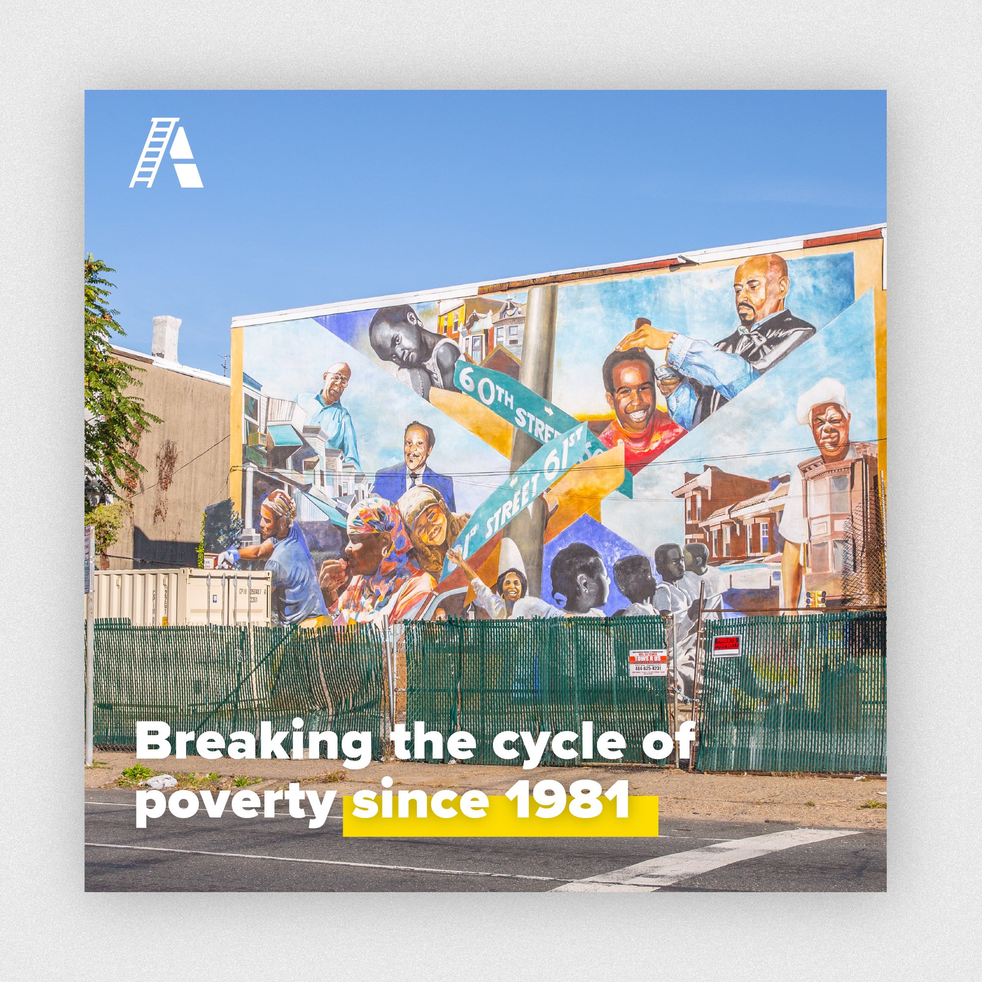
ACHIEVEability is a non-profit based in West Philadelphia that works to break the cycle of poverty by helping low-income, single parent and homeless families to achieve self-sufficiency. Everything they do is geared toward helping their participants succeed and reach the goals they set for themselves and their families.
ACHIEVEability
The challenge: An incoherent presence
ACHIEVEability’s brand was dated, fractured, and lacked cohesion across their materials and channels. They were working with an outdated website, two legacy logos, and an inconsistent color palette. The FS design team used our Volunteer Time Off to dedicate our time to reimagining a new brand for the organization that more clearly expressed their values.
The team
Strategy + Art Direction: Christine Sheller + Lauren Dougherty
Design: Elle Trost
Photography: Endrit Faslliaj
Production: Dave Sloboda
The approach
After meeting with their team, we explored several themes that would convey their mission.
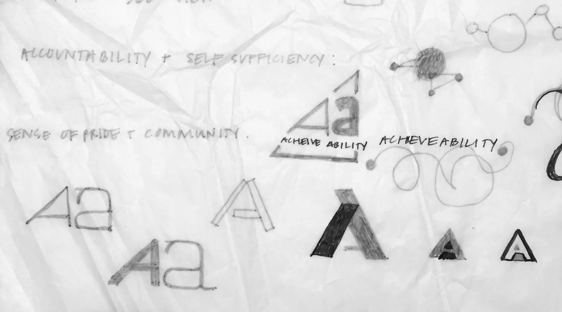
I started sketching some ideas that explored themes of change, access, breaking cycles, pathways, and lifting others up.
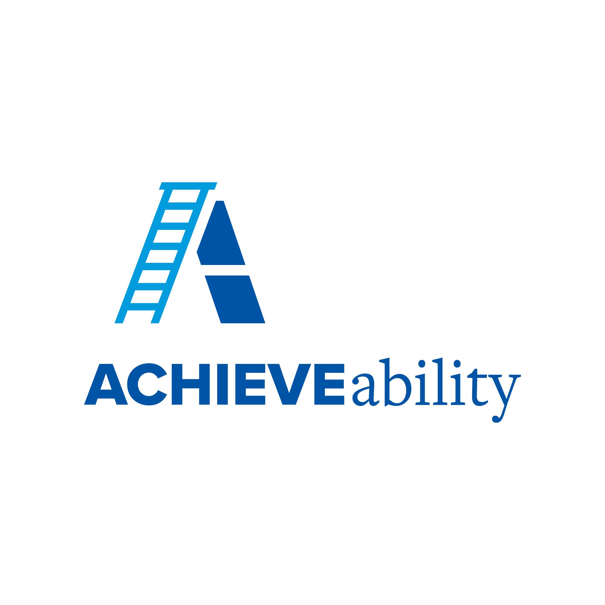
One visual element that they felt strongly about was the ladder — the pathway out of poverty isn’t an easy road to travel and the leadership team wanted to convey a sense that change is possible through hard work and dedication.
Brand elements
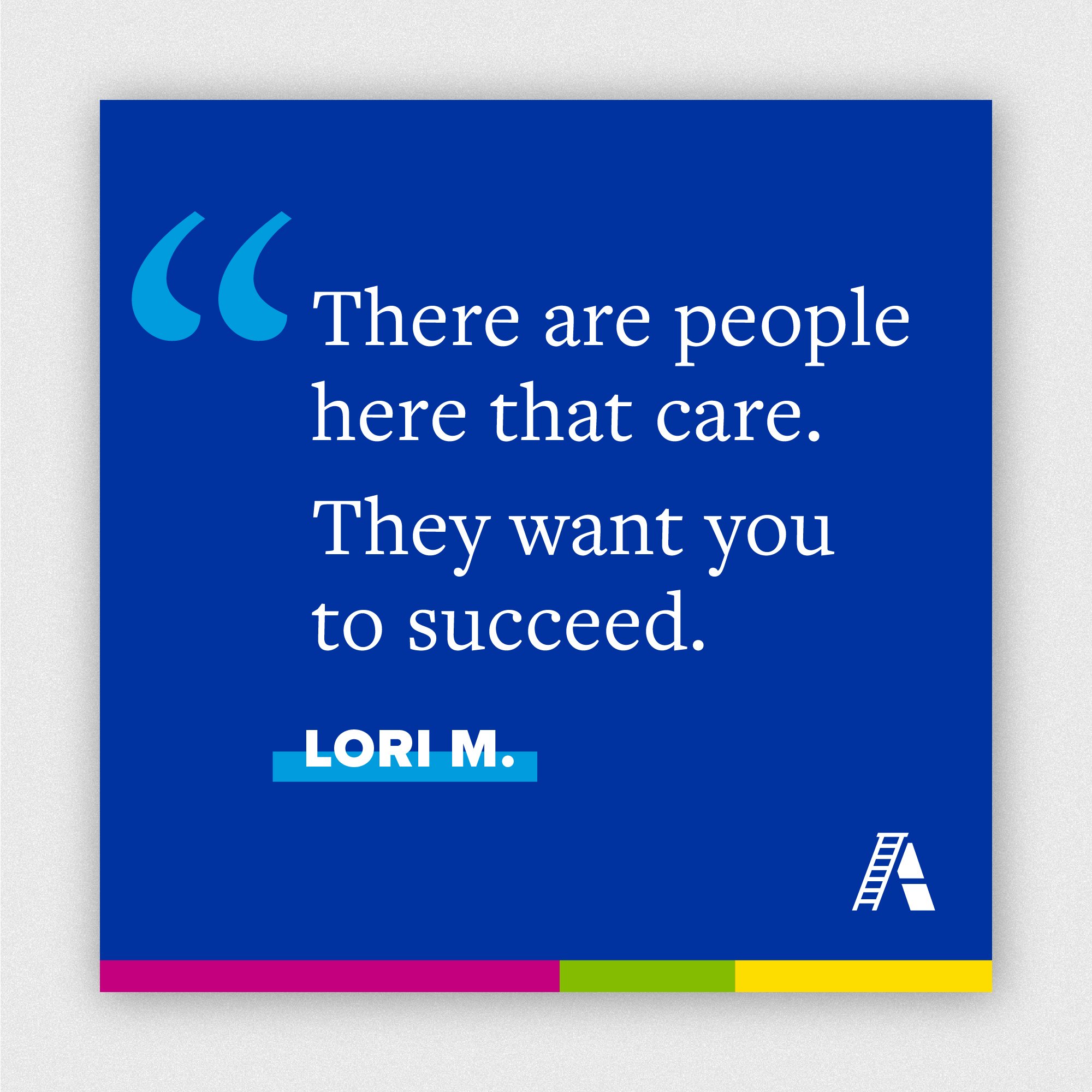
We selected visual elements that are bright, vibrantly joyful and fresh. The color palette to brings life, personality and charisma to the brand. The bright hues infuse their communications with positivity balanced with seriousness. The color palette embodies the indomitable spirit of the families that go through the program.


The Brand Guidelines
We provided Brand Guidelines that included all of their brand elements as well as a vibrant new image strategy. Our photographer provided a library of images for them to use in their marketing covering several categories and subjects.


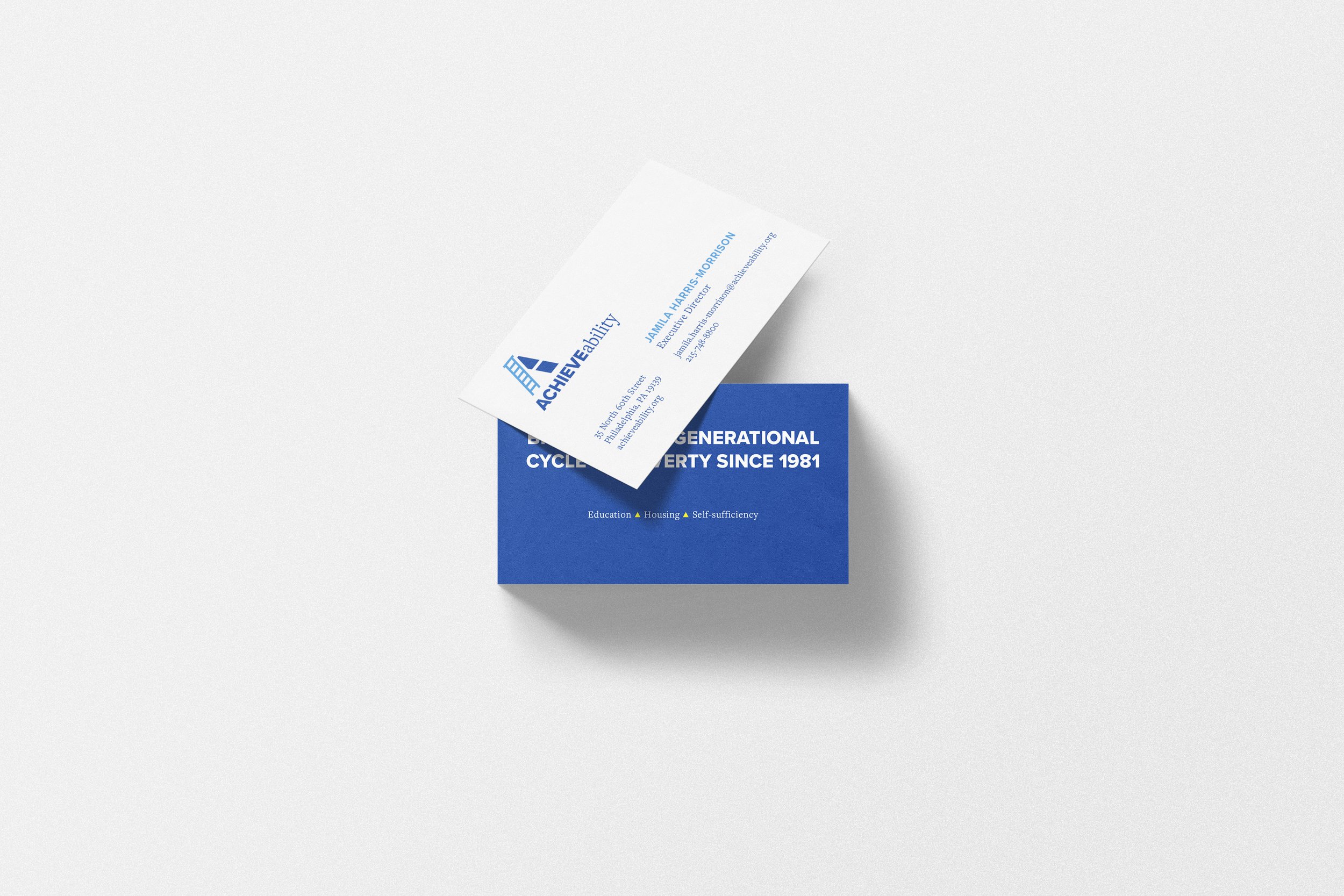
Printed matter
I designed business cards, stationery, and templates for the ACHIEVEability team to self-provision. We wanted to convey a sense of playfulness and approachability, while maintaining a level of sophistication and simplicity.


The discards
Below are some of the explorations that evolved into their current mark.
